The plotting functionality of Kwant has been used extensively (through
plot and map) in the previous tutorials. In
addition to this basic use, plot offers many options to change
the plotting style extensively. It is the goal of this tutorial to show how
these options can be used to achieve various very different objectives.
See also
The complete source code of this example can be found in
tutorial/plot_graphene.py
We begin by first considering a circular graphene quantum dot (similar to what has been used in parts of the tutorial Beyond square lattices: graphene.) In contrast to previous examples, we will also use hoppings beyond next-nearest neighbors:
lat = kwant.lattice.honeycomb()
a, b = lat.sublattices

def make_system(r=8, t=-1, tp=-0.1):

    def circle(pos):
        x, y = pos
        return x**2 + y**2 < r**2

    sys = kwant.Builder()
    sys[lat.shape(circle, (0, 0))] = 0
    sys[lat.neighbors()] = t
    sys.eradicate_dangling()
    if tp:
        sys[lat.neighbors(2)] = tp

    return sys
Note that adding hoppings hoppings to the n-th nearest neighbors can be
simply done by passing n as an argument to
neighbors. Also note that we use the method
eradicate_dangling to get rid of single atoms sticking
out of the shape. It is necessary to do so before adding the
next-nearest-neighbor hopping [1].
Of course, the system can be plotted simply with default settings:
def plot_system(sys):
    kwant.plot(sys)
However, due to the richer structure of the lattice, this results in a rather busy plot:

A much clearer plot can be obtained by using different colors for both
sublattices, and by having different line widths for different hoppings. This
can be achieved by passing a function to the arguments of
plot, instead of a constant. For properties of sites, this
must be a function taking one site as argument, for hoppings a function taking
the start end end site of hopping as arguments:
    def family_color(site):
        return 'black' if site.family == a else 'white'

    def hopping_lw(site1, site2):
        return 0.04 if site1.family == site2.family else 0.1

    kwant.plot(sys, site_lw=0.1, site_color=family_color, hop_lw=hopping_lw)
Note that since we are using an unfinalized Builder, a site is really an
instance of Site. With these adjustments we arrive at a plot
that carries the same information, but is much easier to interpret:
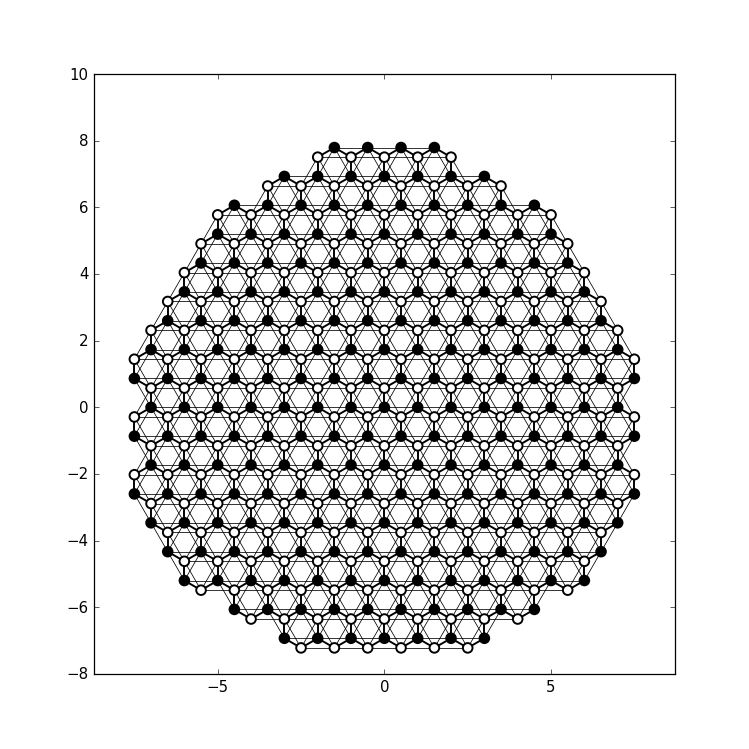
Apart from plotting the system itself, plot can also be used
to plot data living on the system.
As an example, we now compute the eigenstates of the graphene quantum dot and intend to plot the wave function probability in the quantum dot. For aesthetic reasons (the wave functions look a bit nicer), we restrict ourselves to nearest-neighbor hopping. Computing the wave functions is done in the usual way (note that for a large-scale system, one would probably want to use sparse linear algebra):
def plot_data(sys, n):
    import scipy.linalg as la

    sys = sys.finalized()
    ham = sys.hamiltonian_submatrix()
    evecs = la.eigh(ham)[1]

    wf = abs(evecs[:, n])**2
In most cases, to plot the wave function probability, one wouldn’t use
plot, but rather map. Here, we plot the
n-th wave function using it:
kwant.plotter.map(sys, wf, oversampling=10, cmap='gist_heat_r')
This results in a standard pseudocolor plot, showing in this case (n=225) a
graphene edge state, i.e. a wave function mostly localized at the zigzag edges
of the quantum dot.
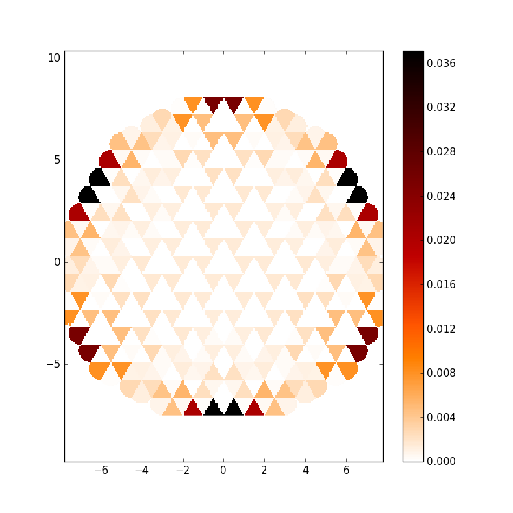
However although in general preferable, map has a few
deficiencies for this small system: For example, there are a few distortions at
the edge of the dot. (This cannot be avoided in the type of interpolation used
in map). However, we can also use plot to
achieve a similar, but smoother result.
For this note that plot can also take an array of floats (or
function returning floats) as value for the site_color argument (the same
holds for the hoppings). Via the colormap specified in cmap these are mapped
to color, just as map does! In addition, we can also change
the symbol shape depending on the sublattice. With a triangle pointing up and
down on the respective sublattice, the symbols used by plot fill the space
completely:
    def family_shape(i):
        site = sys.site(i)
        return ('p', 3, 180) if site.family == a else ('p', 3, 0)

    def family_color(i):
        return 'black' if sys.site(i).family == a else 'white'

    kwant.plot(sys, site_color=wf, site_symbol=family_shape,
               site_size=0.5, hop_lw=0, cmap='gist_heat_r')
Note that with hop_lw=0 we deactivate plotting the hoppings (that would not
serve any purpose here). Moreover, site_size=0.5 guarantees that the two
different types of triangles touch precisely: By default, plot
takes all sizes in units of the nearest-neighbor spacing. site_size=0.5
thus means half the distance between neighboring sites (and for the triangles
this is interpreted as the radius of the inner circle).
Finally, note that since we are dealing with a finalized system now, a site i
is represented by an integer. In order to obtain the original
Site, sys.site(i) can be used.
With this we arrive at

with the same information as map, but with a cleaner look.
The way how data is presented of course influences what features of the data
are best visible in a given plot. With plot one can easily go
beyond pseudocolor-like plots. For example, we can represent the wave function
probability using the symbols itself:
    def site_size(i):
        return 3 * wf[i] / wf.max()

    kwant.plot(sys, site_size=site_size, site_color=(0, 0, 1, 0.3),
               hop_lw=0.1)
Here, we choose the symbol size proportional to the wave function probability, while the site color is transparent to also allow for overlapping symbols to be visible. The hoppings are also plotted in order to show the underlying lattice.
With this, we arrive at
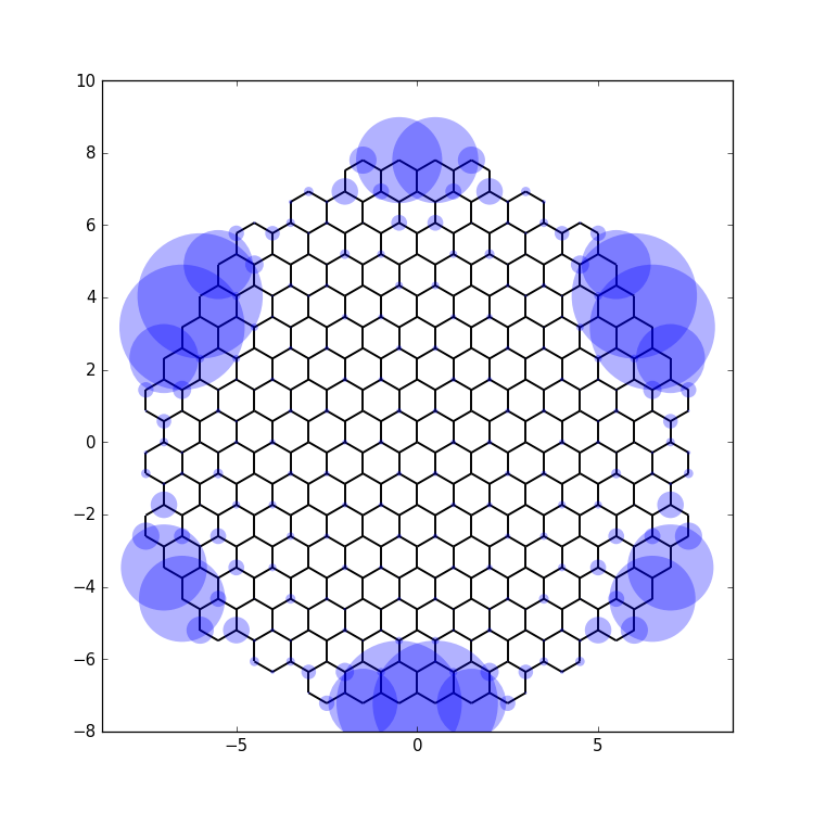
which shows the edge state nature of the wave function most clearly.
Footnotes
| [1] | A dangling site is defined as having only one hopping connecting it to the rest. With next-nearest-neighbor hopping also all sites that are dangling with only nearest-neighbor hopping have more than one hopping. |
See also
The complete source code of this example can be found in
tutorial/plot_zincblende.py
Zincblende is a very common crystal structure of semiconductors. It is a face-centered cubic crystal with two inequivalent atoms in the unit cell (i.e. two different types of atoms, unlike diamond which has the same crystal structure, but two equivalent atoms per unit cell).
It is very easily generated in Kwant with kwant.lattice.general:
lat = kwant.lattice.general([(0, 0.5, 0.5), (0.5, 0, 0.5), (0.5, 0.5, 0)],
                            [(0, 0, 0), (0.25, 0.25, 0.25)])
a, b = lat.sublattices
Note how we keep references to the two different sublattices for later use.
A three-dimensional structure is created as easily as in two dimensions, by using the shape-functionality:
def make_cuboid(a=15, b=10, c=5):
    def cuboid_shape(pos):
        x, y, z = pos
        return 0 <= x < a and 0 <= y < b and 0 <= z < c

    sys = kwant.Builder()
    sys[lat.shape(cuboid_shape, (0, 0, 0))] = None
    sys[lat.neighbors()] = None

    return sys
We restrict ourselves here to a simple cuboid, and do not bother to add real
values for onsite and hopping energies, but only the placeholder None (in a
real calculation, several atomic orbitals would have to be considered).
plot can plot 3D systems just as easily as its two-dimensional
counterparts:
    sys = make_cuboid()

    kwant.plot(sys)
resulting in
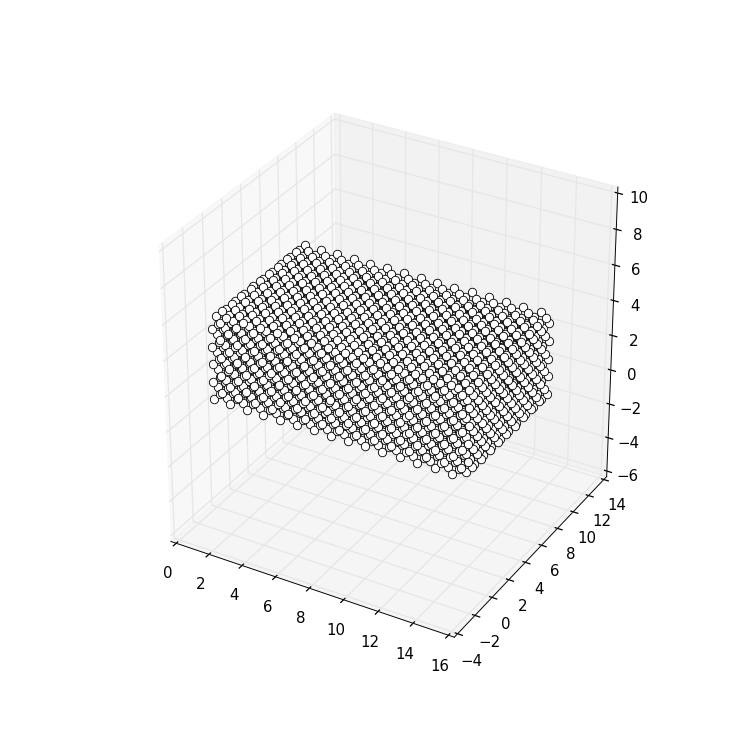
You might notice that the standard options for plotting are quite different in
3D than in 2D. For example, by default hoppings are not printed, but sites are
instead represented by little “balls” touching each other (which is achieved by
a default site_size=0.5). In fact, this style of plotting 3D shows quite
decently the overall geometry of the system.
When plotting into a window, the 3D plots can also be rotated and scaled arbitrarily, allowing for a good inspection of the geometry from all sides.
Note
Interactive 3D plots usually do not have the proper aspect ratio, but are a bit squashed. This is due to bugs in matplotlib’s 3D plotting module that does not properly honor the corresponding arguments. By resizing the plot window however one can manually adjust the aspect ratio.
Also for 3D it is possible to customize the plot. For example, we can explicitly plot the hoppings as lines, and color sites differently depending on the sublattice:
    sys = make_cuboid(a=1.5, b=1.5, c=1.5)

    def family_colors(site):
        return 'r' if site.family == a else 'g'

    kwant.plot(sys, site_size=0.18, site_lw=0.01, hop_lw=0.05,
               site_color=family_colors)
which results in a 3D plot that allows to interactively (when plotted in a window) explore the crystal structure:
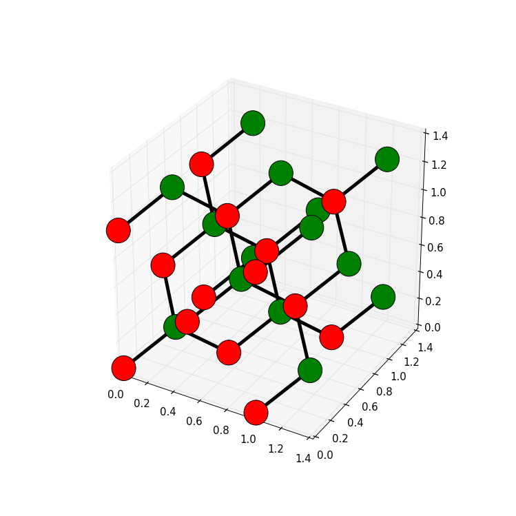
Hence, a few lines of code using Kwant allow to explore all the different crystal lattices out there!
Note